designed: 2013 by ramzi makram-ebeid
With limited space, my clients asked for a concept store that would showcase their vast collections and reflect the quality and their value for money. Focusing on solid wood furniture and accessories from South East Asia, Casa Carina’s long term vision was to include collections from other parts of the world as well. With all of this in mind I sought to create a style-neutral space and to design using a smart budget.
Conceptualizing
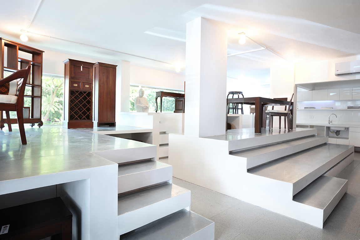
Efficient, sleek and cost-effective, this is where the concept of a ‘high-end storage room’ came from. By minimizing unnecessary finishes and decorative items, the space serves merely as a backdrop to Casa’s line. To maximize on display space, I created a second level to fit the shorter items on the lower shelves, while the taller items fit on the upper shelves. Walking in, clients can see both levels simultaneously, and if interested, can make their way to the upper level for a closer browse. Though the two levels literally doubled the display space, there was still a need for more.
Since one of my tech-savvy clients is usually present at the showroom and since Apps are becoming more common place in commercial outlets, my solution to the needed display space was found. What I regard as somewhat of a futuristic concept store, I placed a central display and seating area opposite to a large curtain wall, meant for products to be displayed via a projector above. Facing the middle of the screen, clients can upload their home pictures and see Casa’s products – actual size – integrated into their home, or they can scroll the catalogue and any other photographs or videos they want to discuss.
Working on a Smart Budget
Materials are the most effective way to showcase a smart budget design and their selection is therefore vital. The color scheme is white and silver; the white walls and displays reflect light and are neutral, meanwhile the metal sheets on the stairs and display areas are durable, inexpensive and very appropriate for the ‘high-end storage room’ we were going for.
All of the built-in furniture is minimal and white, blending into the background and made with cost-effective materials. The flooring is a light mosaico, tying in the natural wood to the more sterile white surroundings. The windows were extended and fixed with minimal frames to bring in as much natural light as possible, as well as to expose the store from the exterior.
The lighting design is functional and focuses mainly on the display. The second level is lit using energy saving light bulbs placed above; the tube system was economical and a convenient alternative to using a false ceiling, which would naturally shorten the height of the space. All other lighting is indirect and comes from behind or below the storage areas. The lighting for the kitchen and office space uses the same exposed and indirect lighting used for the display.
Taking it Outside
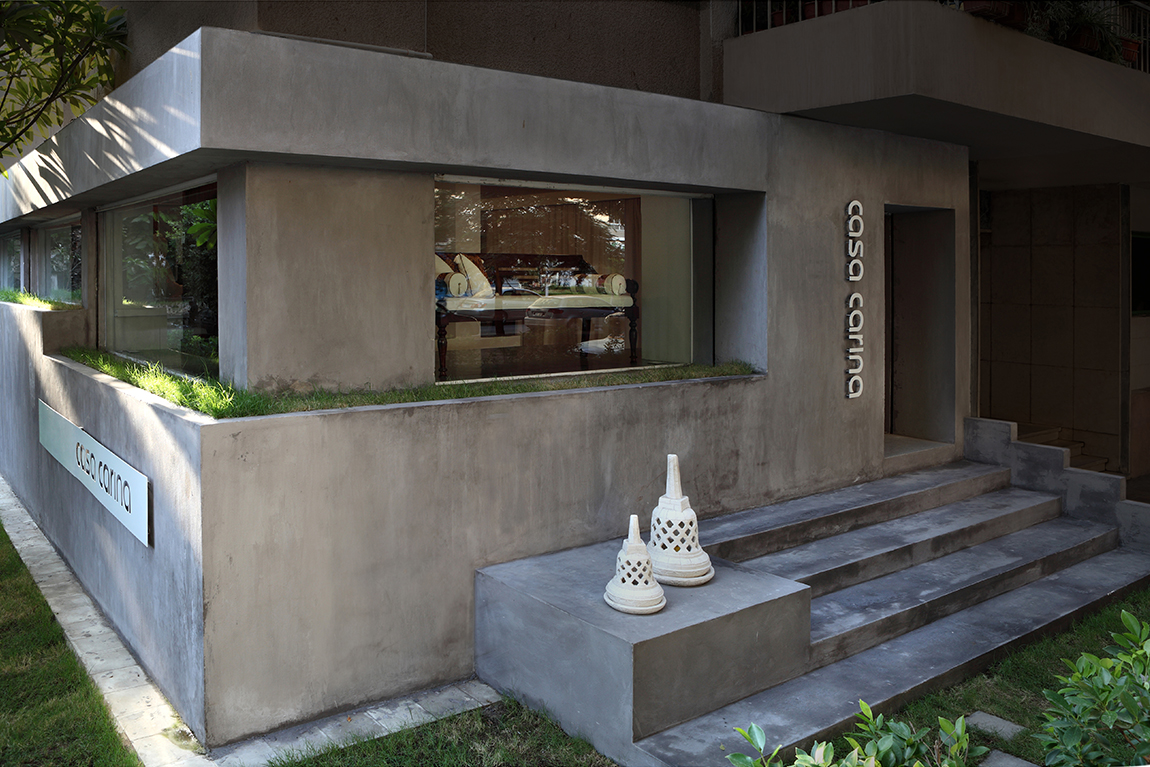
The exterior of the store is minimal and focuses on the size of the windows. Day or night the products on the upper levels are clearly visible, enticing foot traffic to come inside. The gray concrete exterior serves to be as neutral as the interior, while the signage uses one sheet of metal cut out in letters.
In wanting to create a backdrop for Casa’s outdoor collections – and inject Cairo with a bit of greenery – we surrounded the store with grass and planters. The exterior steps are the same design as the interior ones, once again establishing a link to the overall space.


