photography by ahmed ehab
designed: 2020 by ramzi makram-ebeid
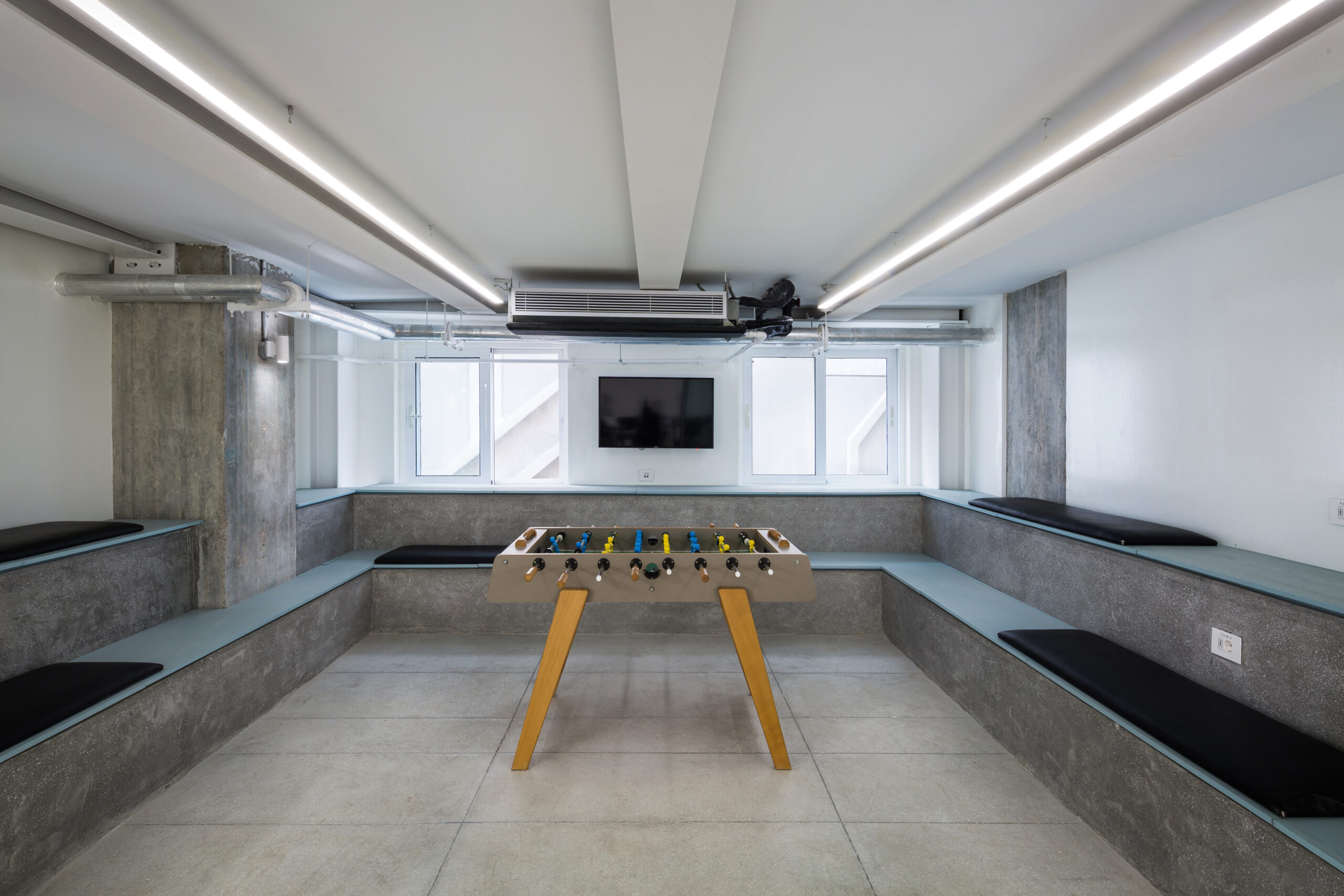
Located near the Giza Pyramids, this office belongs to Eva, a third generation pharmaceutical company, and accommodates the sales, marketing and HR departments. The owner wanted a space that would motivate and inspire his team members. The office was to reflect his new style of management; a more laidback style, based on teamwork and celebrating an interactive working day.
The office needed to house the different teams comfortably and to provide efficient, convenient workspaces for the team members. Aside from a large number of employees and subsequent workstations, the space also needed private rooms for directors, closed-off meeting rooms, a printing area, large-scale bathrooms, private phone booths away from the open workspace, ample storage and for the first time in the history of the company: chill out rooms. The original space was quite dark with only one wall of windows, so bringing in maximum sunlight was equally high on the list of requirements.
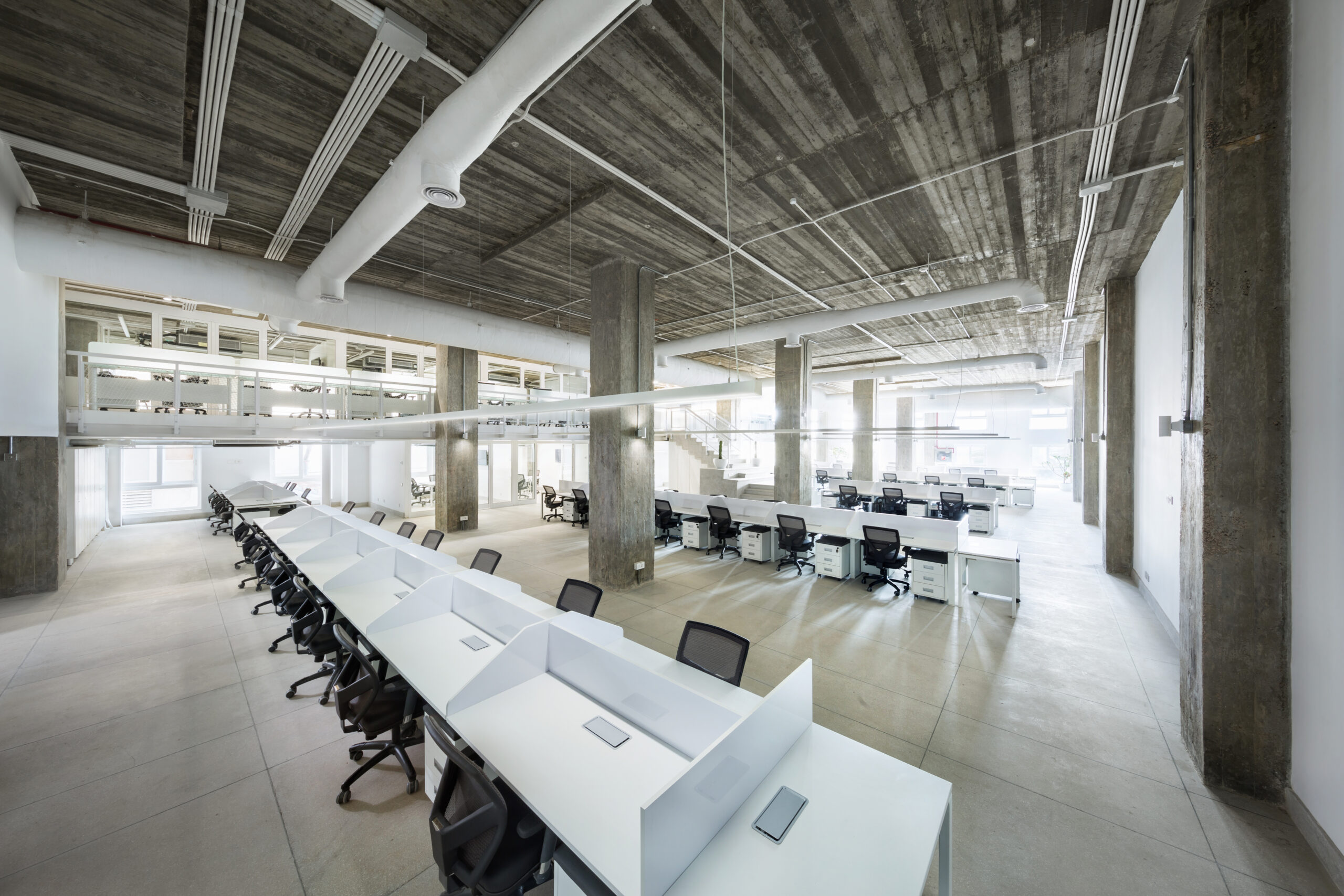
I began by creating enough room for all of the above to fit. Since the ceilings were 4.8 meters high, there was an opportunity to build mezzanines and increase the overall surface area of the office. At the start of the project, the office stood at 2330 square meters, post design the space had expanded to 3390 square meters. As such, circulation improved and we were able to provide team members with added personal space, as well as the ability to move around the office with ease.
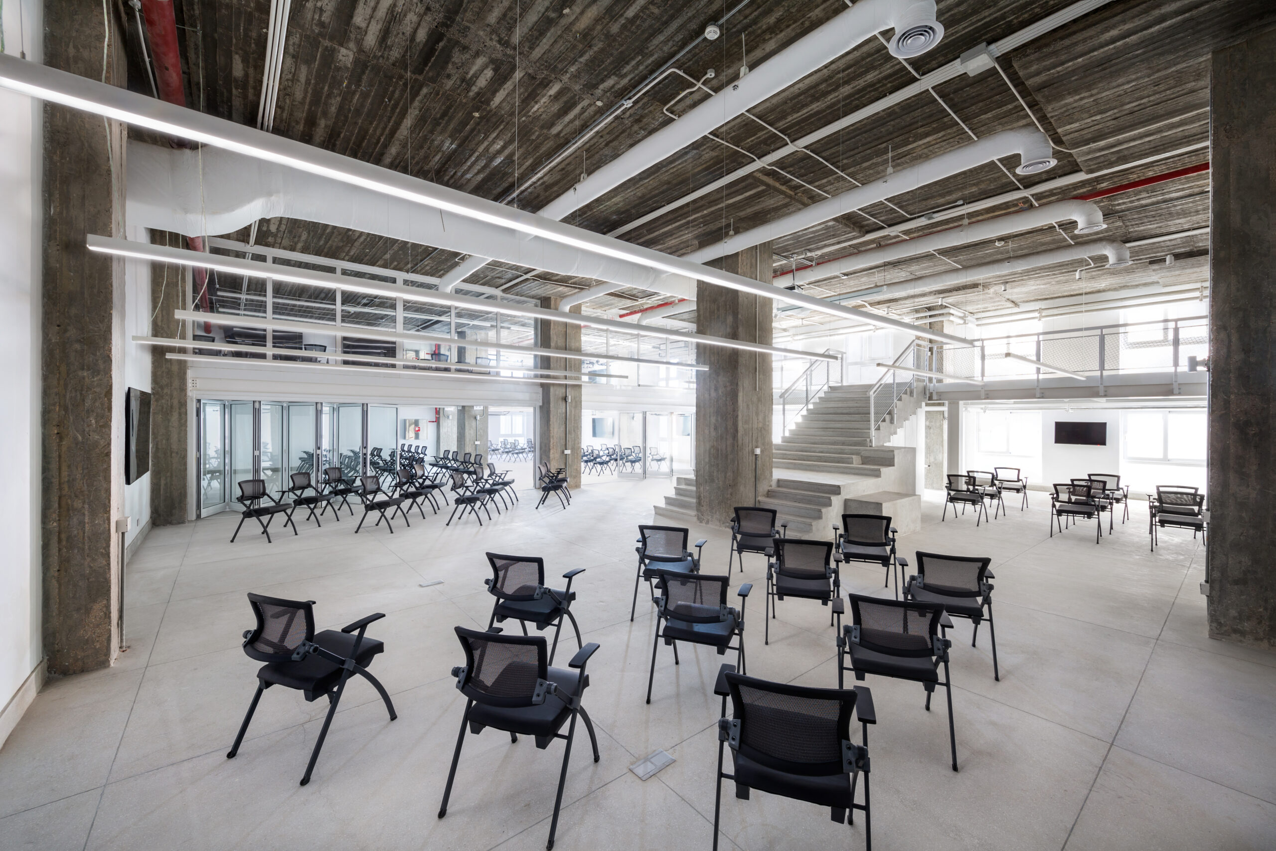
The double-height ceiling was crucial in the use of mezzanines and it worked to bring in the light as well. The office was divided into four zones based on their purposes and for the light to enter, I ensured each zone was rewarded a portion of the original high ceiling. This configuration brightened the office and also made it feel more spacious.
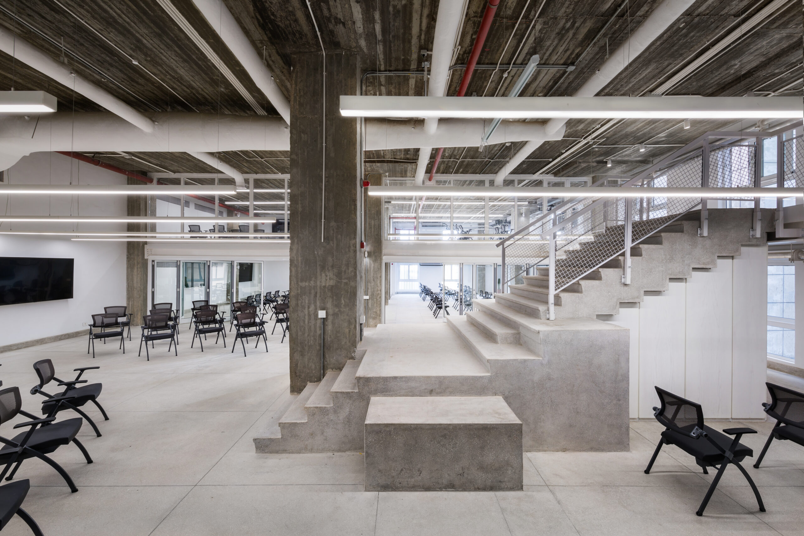
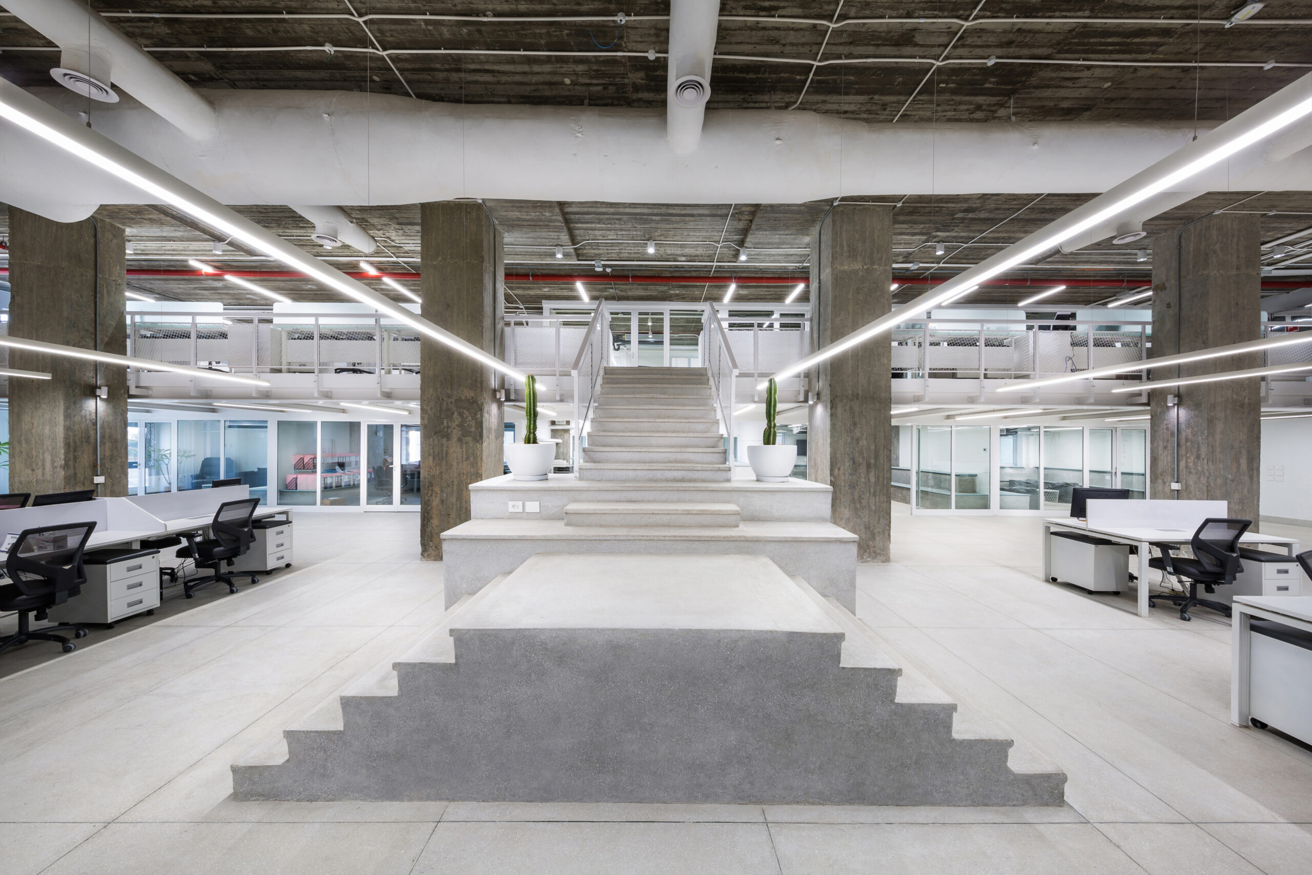
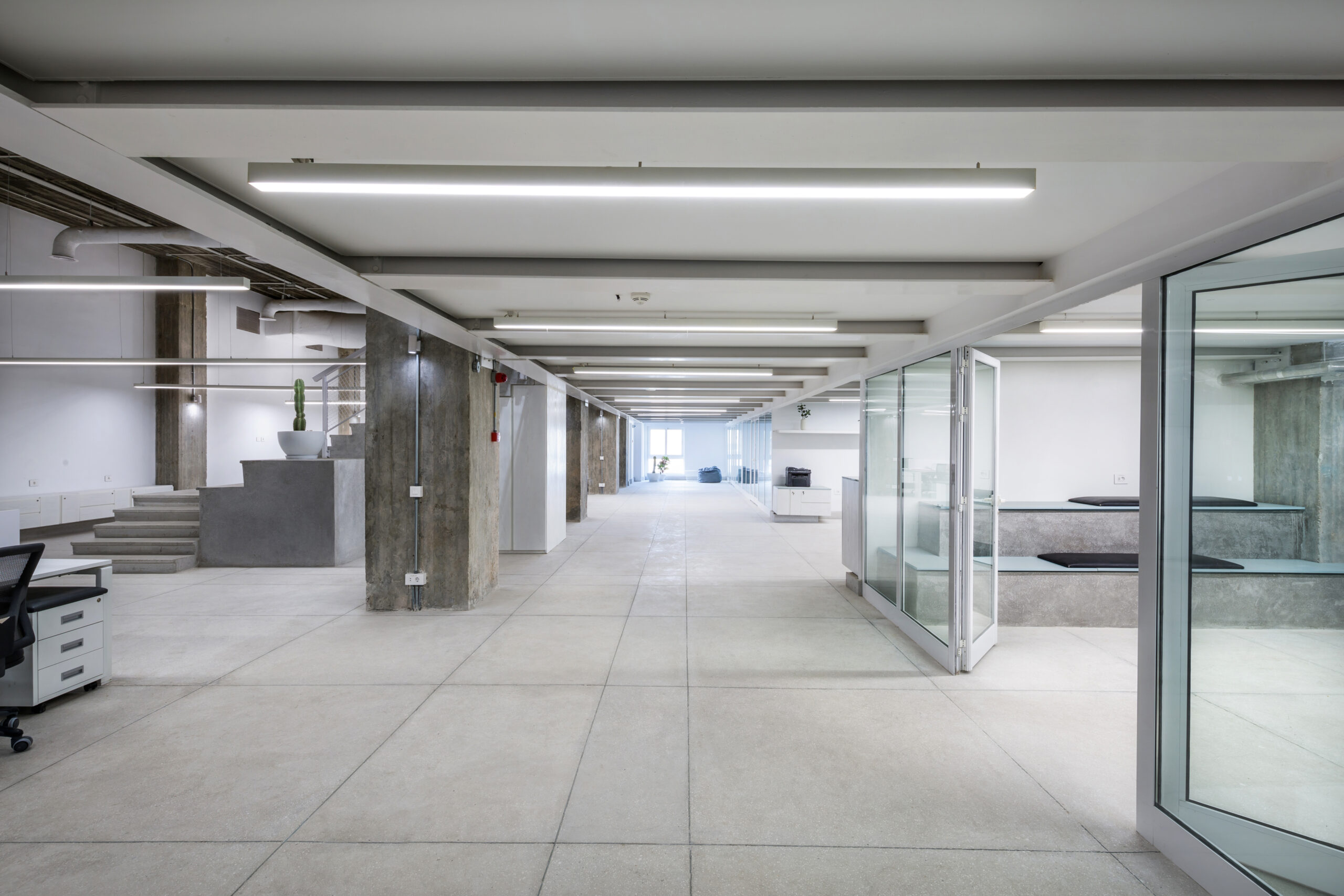
At the center of every zone is a large-scale staircase that segments the given area and doubles as individual presentation stages. Each area was given direct TV access, and multiple USB/power outlets and designed with smaller work zones that include functional lighting, sound control and HVAC.
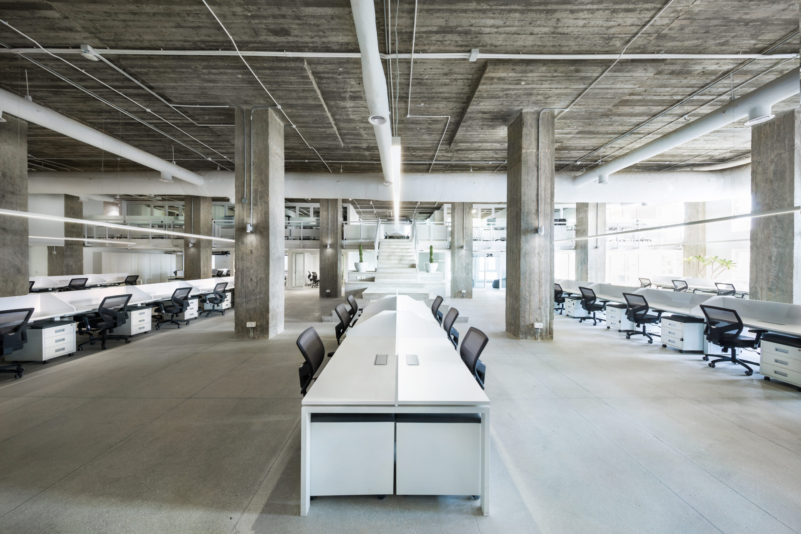
Zones One, Two and Three are similar and mostly made up of open, shared workspaces. Each of their individual workstations is at least 1.6 meters wide with countertop USB/power controls, dividers that function as whiteboards and a filing cabinet that is also a seat – a wonderful design by Mohm.
Amongst the four zones, one is categorically different: the Conference Zone. Located across the hall from Zone One, this area was required to house 200 salespeople at the same time and to provide those 200 people with the physical space to split up into smaller focus groups. Since the space was naturally dark, I chose double-glazed folding partitions to maximize the amount of entering light. All the chairs in this area are folding, as are the tables, which allows for the flexibility of sitting at a desk or opting for a conference room setup.
Zone One and the Conference Zone share a reception and restrooms; the directors in Zones Two-Four have private restrooms. The meeting rooms are found downstairs due to their higher traffic, while the private offices (and their private bathrooms) are upstairs on the mezzanines, with access through the zone’s central staircase.
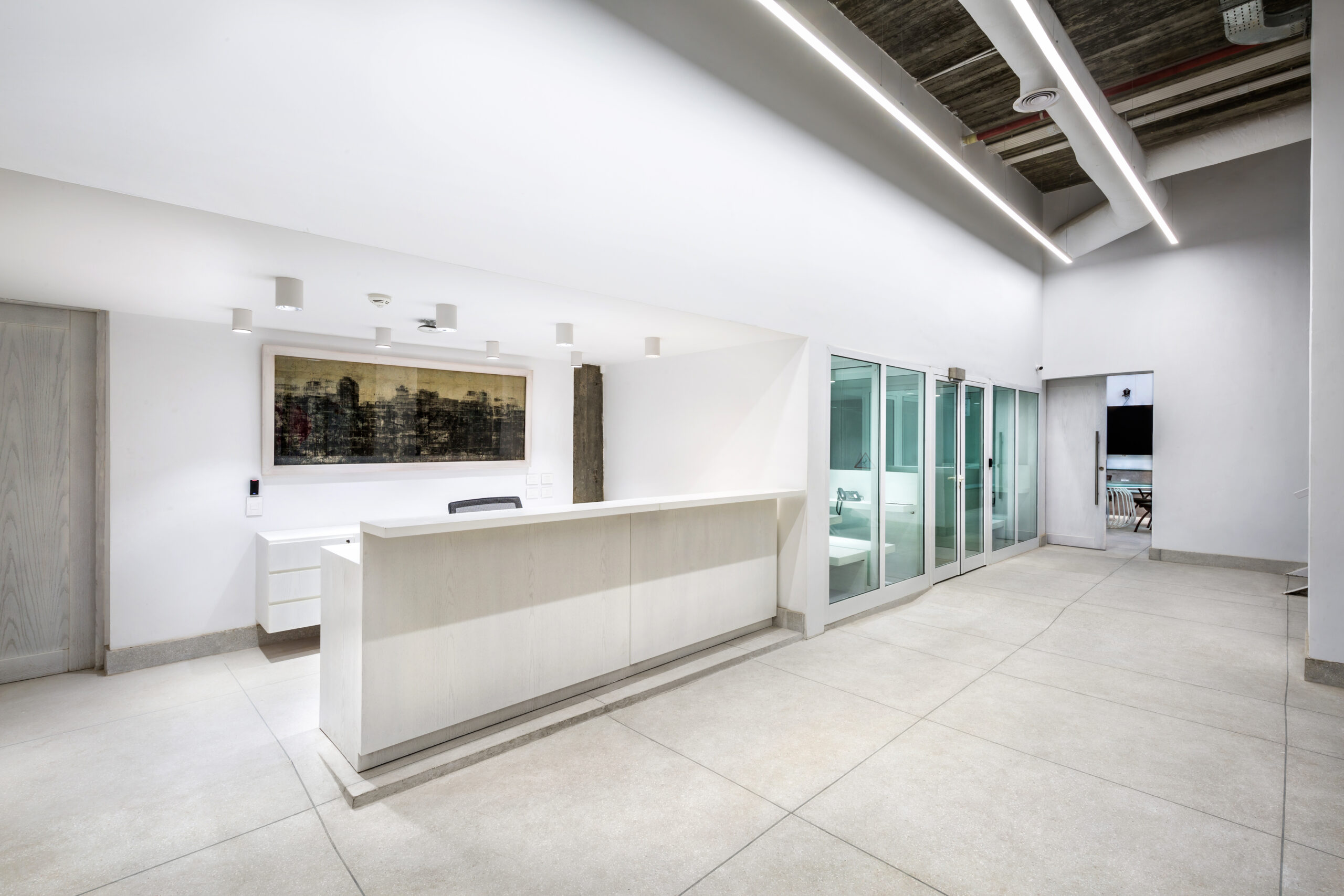
The reception desk is in the middle of the zones and across from the building’s main staircase and elevators. The main restrooms were designed to save on space, but still allow for easy access without having to wait.
Once the zoning and functionality of the space were determined, we began to focus on the concept. The owner wanted a clean space with minimal hues and an industrial twist. A palette of mostly white and gray created the right effect and was ideal for an environment meant for creativity. White also makes spaces feel bigger and helps increase the light. For a splash of green and earthiness, I placed plant pots with cactus here and there.
The flooring is a poured light gray mosaic mixed with white stone chips, the white shards further reflect the light and give the floor an interesting, organic finish. Since this type of flooring requires grooves to protect it from cracking, I took the opportunity to play around with the pattern.
I wanted the workstations to have writable surfaces and Mohm’s sleek workstations with whiteboard dividers were an ideal option. This feature is perfect for employees to use at their convenience and also to personalize their desks. The filing cabinets are white like the partitions, with a fixed cushion on top for extra seating. The desk chairs everywhere in the office were custom ordered from Williams Office and have a charcoal frame and leather seating.
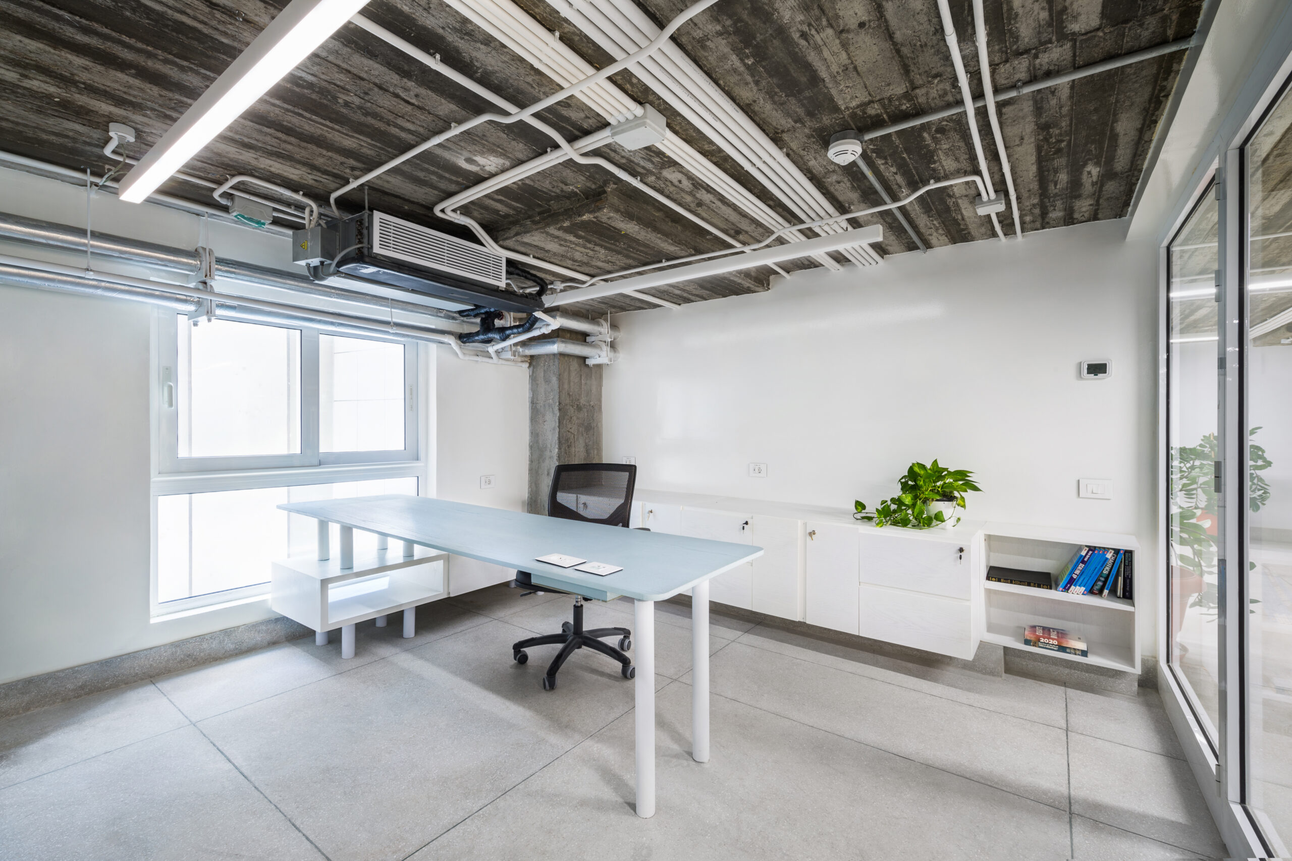
I customized the private office desks myself, which were designed as either L-shaped or pill-shaped. Using the same palette as the rest of the office, the private rooms have a white, textured metal finish and white-washed wood furniture. These rooms also have writable walls and were given ample storage space.
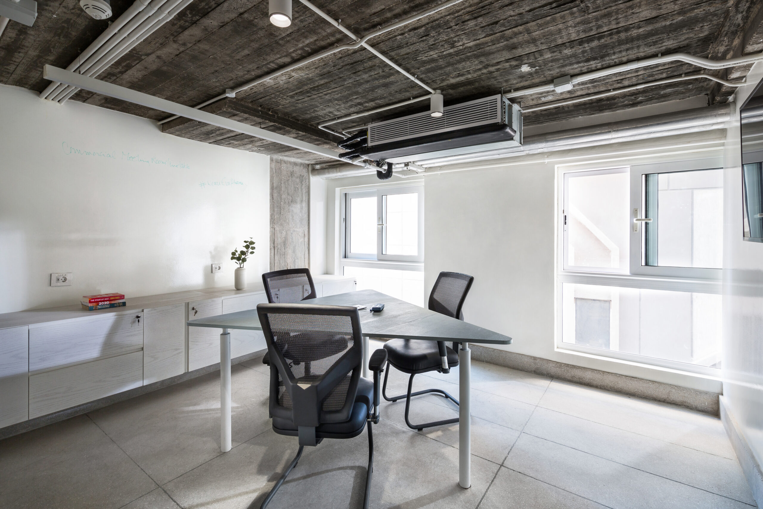
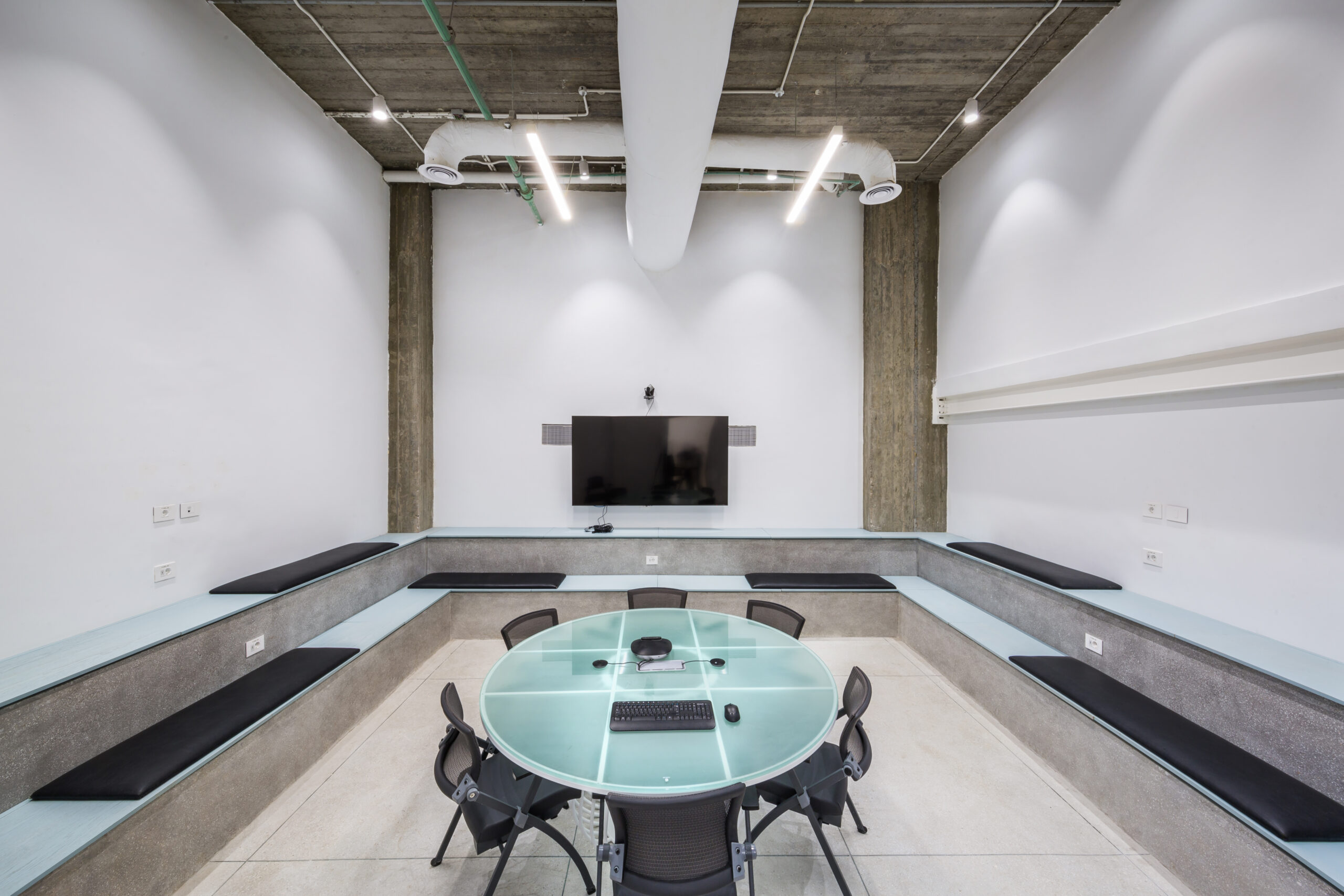
The tables in the meeting room were also customized by myself and were inspired by ancient Egyptian medicine cabinets, only I designed the base with wire for a less bulky product. Most meeting rooms offer added step seating (with hidden storage) and bench seating.
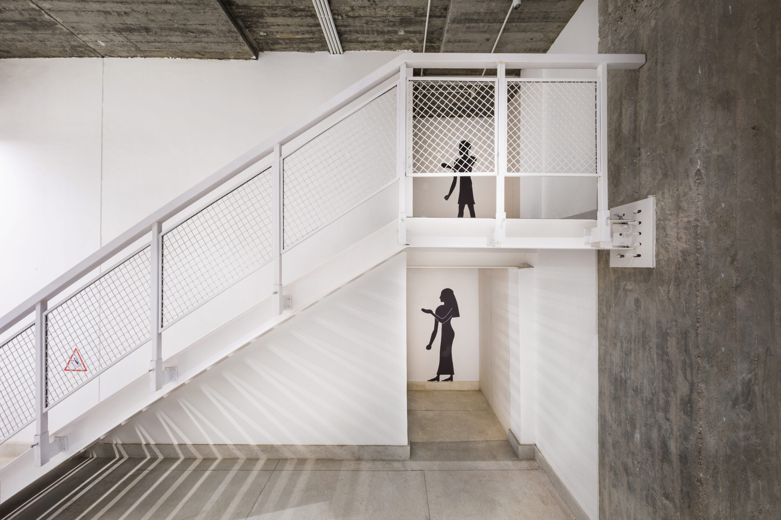
I used the walls and underneath the stairs to create more storage space. A whitewash finish on the storage areas adds more texture to the range of whites and grays throughout the space. The staircases’ railings carry on the theme with a textured white finish as well.
Seeing as the office was near the Pyramids, I wanted to have a little fun with the signage and their fonts. For example, the restrooms have images of oversized ancient Egyptians, while the ‘wet floor’ signs jokingly show an ancient Egyptian man tripping over.

