photography by ahmed ehab
designed: 2016 by ramzi makram-ebeid
With a love of Boho, mid-century, Islamic and African designs, combined with a passion for art and graphic design, Dena’s home needed to showcase all aspects of her dynamic personality. Though allowing each element to shine in its own right was important, I also wanted the space to be minimal and calming.
Since the flat was built in the 1960s, I decided it should fundamentally be mid-century instilled with modern motifs. We began with a gray and white color palette – gray-stained parquet with mixed-white walls and ceilings – to create a blank slate for what was to come. Generally, I like to know exactly how each area will be used and where each furnishing item will be placed, but Dena needed a set up that was open to change so I designed the space to be as flexible as possible.
Socializing Spaces
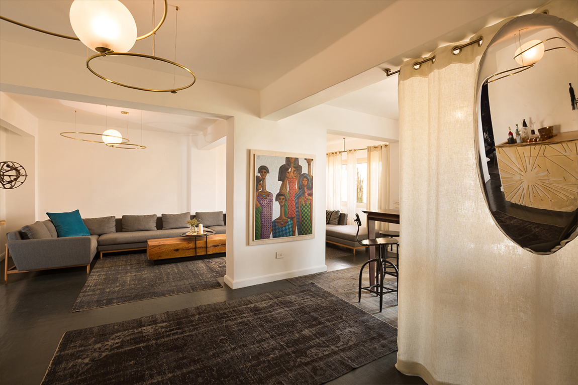
A challenge I faced with Dena’s flat was the expansive entryway, dining and living area. The open space needed to be suitable for hosting parties as well as provide a cozy spot for smaller groups, so I divided up the area.
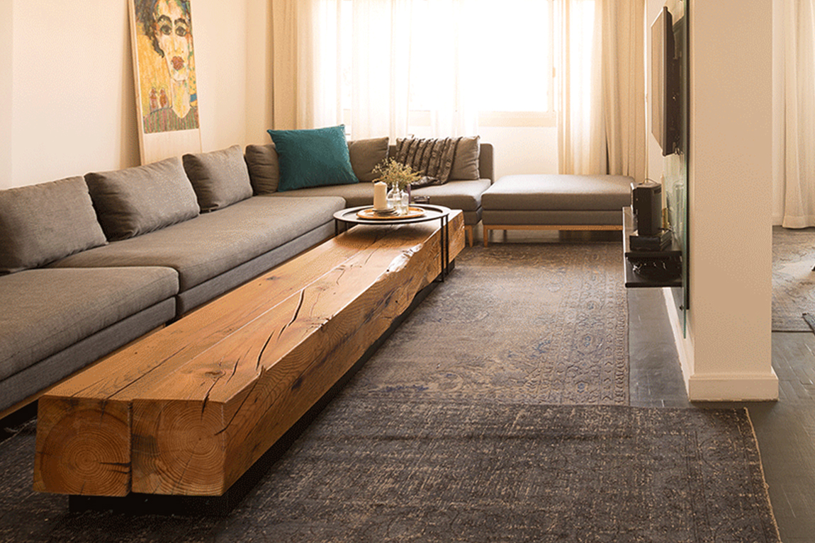
I separated the dining portion using an entry curtain that begins at the main door and extends the length of the designated area. Meanwhile, an oversized, retro-inspired sofa pinpoints the living area. Keeping flexibility in mind, the sofa is modular and made up of five pieces that can be rearranged in whichever way; the gray fabric is neutral, allowing Dena’s stunning art collection to stand out. The custom designed coffee table conveniently functions as a Lazy Suzy and I used wood with a dash of metal for this piece because I wanted it be rustic and to age the room a little bit.
A focal point of the bar area is the Doodle Bar. Custom designed for Dena’s choice of glassware and barware – including a gorgeous Tom Dixon collection – I wanted the bar to be a conversational piece, so I decided to incorporate Dena’s love of doodling into the design. By laser cutting the plywood I’d used, I was able to add one of her creations as well as invisible handles to the bar’s front. Working with Ivanco and their vast knowledge of woodwork helped maximize the internal storage space as well as provide a quality finish.
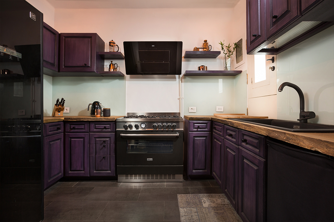
I opened up the walls of the kitchen and though the old kitchen was nice, it lacked character. To resolve this I stained the walls purple and complemented the existing cabinets with badass black knobs Dena had purchased in London.
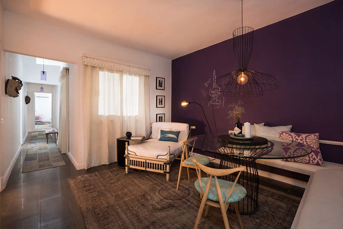
Across from the kitchen was a dead space that we turned into a breakfast/reading nook. Taking two of her favorite things, purple and doodling, I installed a large purple writing surface that added a playful aspect to the space.
The flooring of this whole area, including the inner hallway, required an overhaul so I opted for a gray tile to match the gray stain we did on the parquet. With so many layers at play in the space, repetition and consistency were needed to ensure continuity.
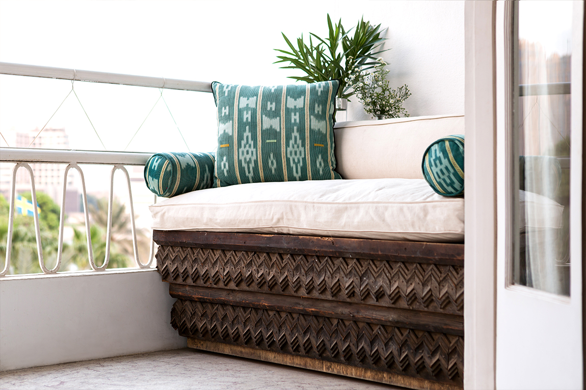
The last of Dena’s socializing areas is the balcony. Boasting a stunning view, we took advantage of the limited space by installing a built in sofa. Using a corniche we’d salvaged at the local Ezbet Belal market, we layered the pieces in a gradient to create extra leg room as well as to add depth to the aesthetic of the piece.
Personal Spaces
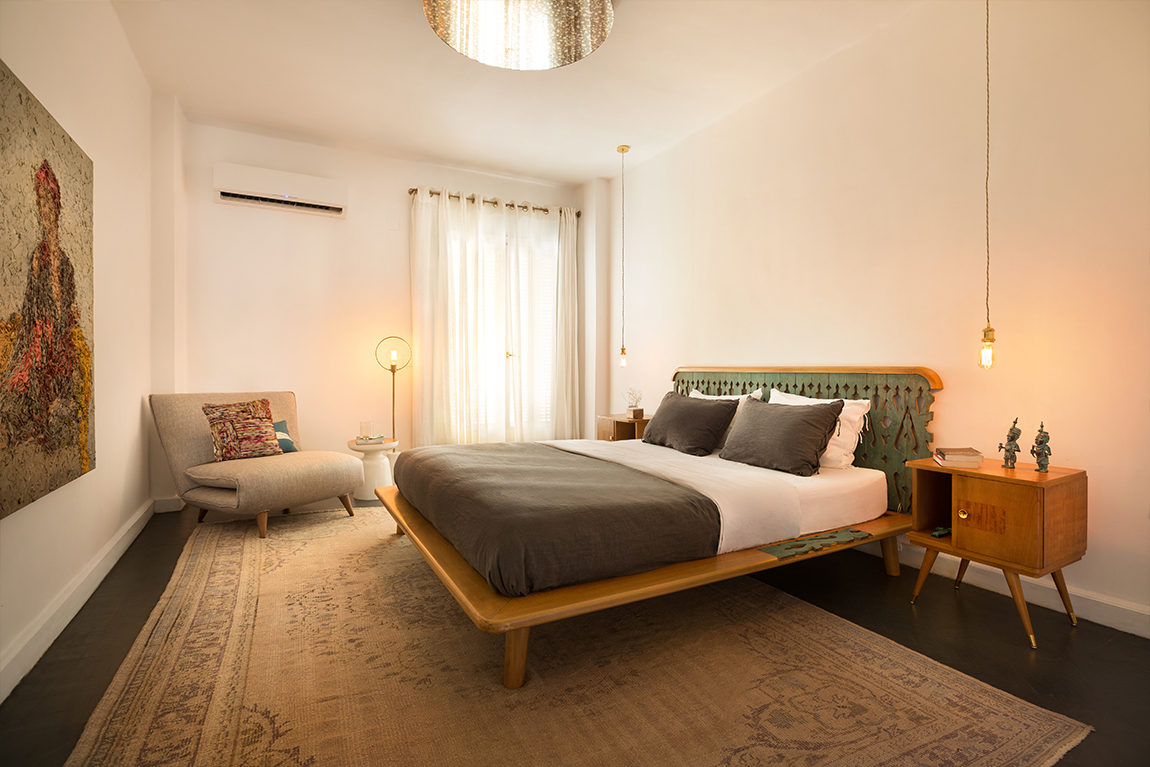
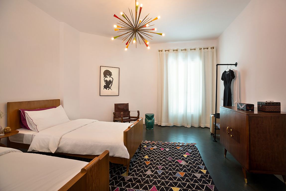
Dena has a great collection of African masks so I selected a few to hang in the hallway leading to the bedrooms, making sure that each piece stands out. The bedroom matches the rest of the flat’s style, but with more serene elements. Maintaining the same color scheme and mood, the bedroom is far less eclectic and Dena was allowed a single artwork by Hossam Dirar, while everything else is functional.
A highlight of the room, the Salvaged Bed took mid-century sensibility and infused it with locally salvaged wood, which in this case was a genuine Egyptian mashrabia. When customizing furniture, I like to be given proper insight into my client’s lifestyle, habits and preferences. In this case, the headboard was designed for leaning back on and by slightly extending the border of the bed on either side, I was able to give my client a convenient place for her eyeglasses and mugs. The backlighting I installed highlights the wood’s accents, bringing the design’s focus back to the mashrabia.
Interestingly, the bathroom was the first room I designed in this flat. Dena wanted to play with water friendly woods, so I designed a large wooden unit for her generous collection of bathroom products and towels. By inserting niches to break the monotony of the wood, I was also able to add a decorative element that displays her accessories.
In regards to furniture, we took our time filtering through a plethora of stores and showrooms around Cairo. We were able to collect some gorgeous Egyptian designs, along with vintage mid-century pieces to accompany the ones passed down from her grandmother. There were also the numerous items Dena had purchased during her travels abroad that rendered the space unique.
Though I prefer to go about the design process in a certain way, Dena led me on a different course that helped to identify her style and taste. I began the project with a client who wasn’t sure of what she wanted and the result was a design that reflected her personality, while staying true to my design philosophy.

