photography by ahmed ehab
designed: 2016 by ramzi makram-ebeid
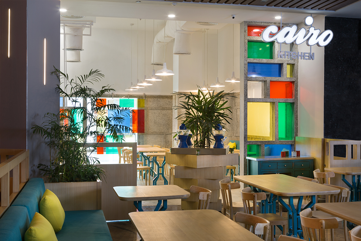
A huge fan of Cairo Kitchen’s original design, I was excited at the opportunity to design their new location in a similar yet minimalistic way. The distinct style of Cairo Kitchen’s outlets was inspired by the Egyptian street food cart: full of color, life and variety. However, the use of certain materials did not bode well with operations, the wooden wall cladding and blue mosaic floor tiles in particular, so I took all of this into consideration while articulating the revamp of the brand.
Zoning and Functionality
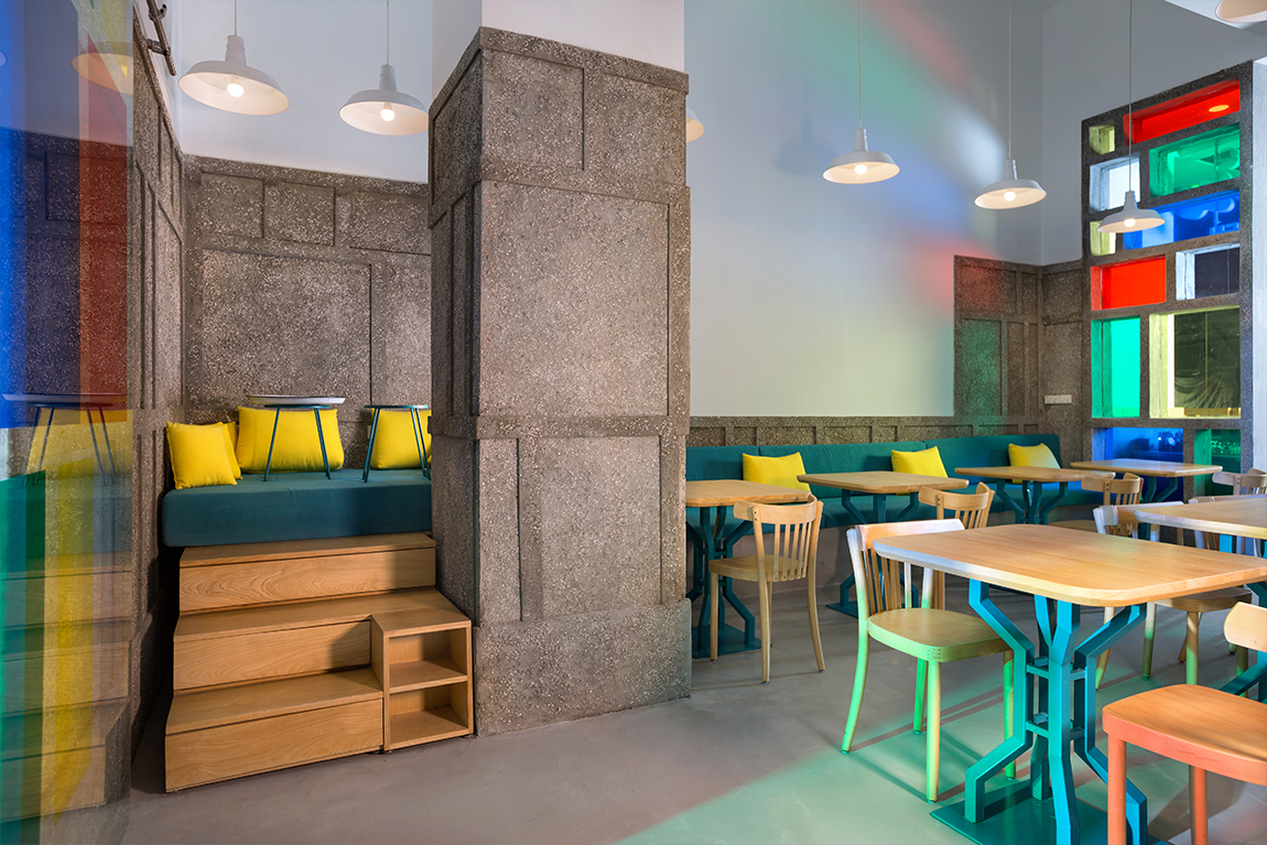
My first step was to define the space and its varying functions. There was a predetermined back kitchen on one side and and a large column on the other; the front kitchen was logically placed next to the back area, while the column inspired an alternative eating nook with built in seating.
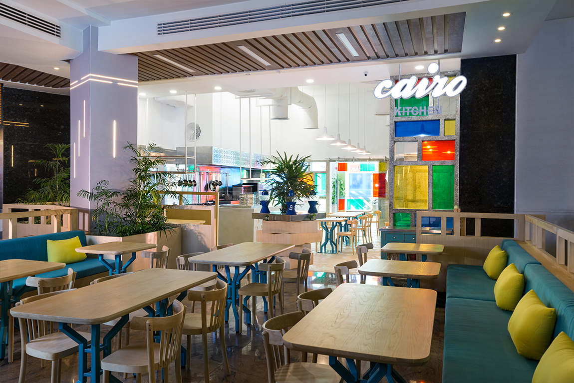
Naturally, I wanted to maximize the number of seats while maintaining efficient circulation. Seeing as the space was pretty tight, the logical solution was to arrange the tables in straight rows and clearly dictate circulation for Cairo Kitchen’s team and for the clientele. In order to contrast the linear layout, I placed Cairo Kitchen’s celebrated drink station at the center of the rows in a circular divide, making sure it was accessible from all sides.
The outdoor area was gated off due to the excessive noise from surrounding restaurants, as well as its visual disturbance. I wanted the space to have a strong identity and to submerge diners into that context from the moment they enter. By creating a high fence and adding landscaping elements, the space was successfully detached from its neighbors.
The Style Process
Once the floor plan was finalized and the functions of the space determined, I began coloring in the shape, so to speak. I wanted to utilize the old design as much as possible, but to create something that was more current and reflected my personal aesthetic. I didn’t object to the street-cart as an inspiration, but in wanting something even more urban, I turned to street cafés instead.
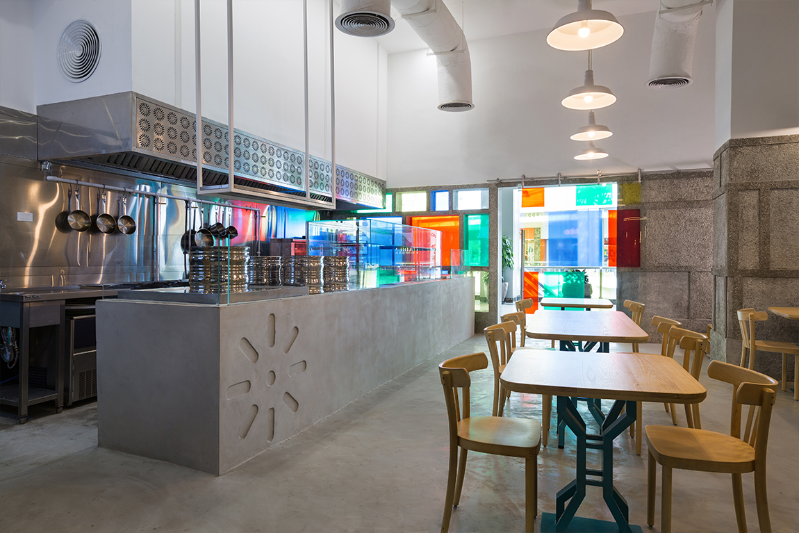
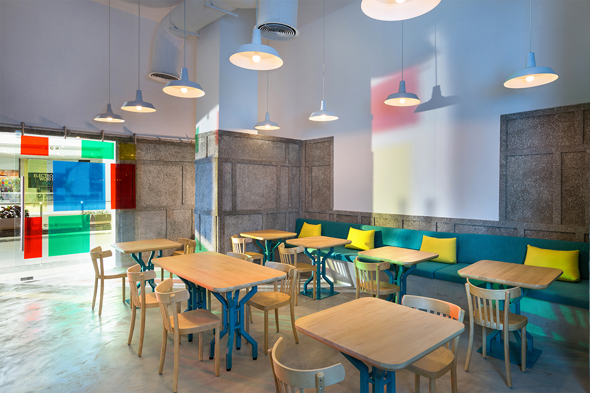
In reference to these cafés, I installed unfinished concrete elements that were polished for a high end effect. The existing pattern on the walls is derived from Cairo Kitchen’s original glass and wood façade. By replacing the wooden frames with smooth concrete and the colored glass with a rougher concrete, the walls became textured and produced a distinct pattern that perfectly fit my vision. Apart from it making sense stylistically, another reason I relied on concrete was its durability and longevity.
Since I wanted Cairo Kitchen to be a happy place for families to enjoy a meal, I balanced out the prominence of concrete with expanses of white and pops of color in the façade’s glass and the furniture. The continuity of the custom designed tables pays homage to the settings we see around Cairo’s street cafés. With wooden tops and sturdy bases, the tables introduce a warm material to the mix and their turquoise finished metal bases add a tinge of color as well. Taken from the glass façade, the turquoise was also used in upholstery elsewhere.
Preparation Station
The establishment wanted an open kitchen that also serves as a display and storage unit for cutlery, condiments and other accessories. This area needed to be uber functional for both the chef and the servers, as well as be the focal point of the space. I approached it with a retro state of mind, in reference to salvaged kitchens from the early 20th century that are very functional yet have a twist. I used the same material as the flooring for the bar in order to bring the attention back to the action happening and the food being prepared. The mesh of the cabinet doors showcases the bright yellow interior, while simultaneously revealing what’s inside. Meanwhile, the antiqued blue color gives the piece a salvaged finish.

